Intro
Bakuchiol Serum is a modern skincare product formulated as a gentle, plant-based alternative to retinol. The brand needed a complete visual identity — from the logo to the packaging and website — that communicated purity, luxury, and scientific credibility.
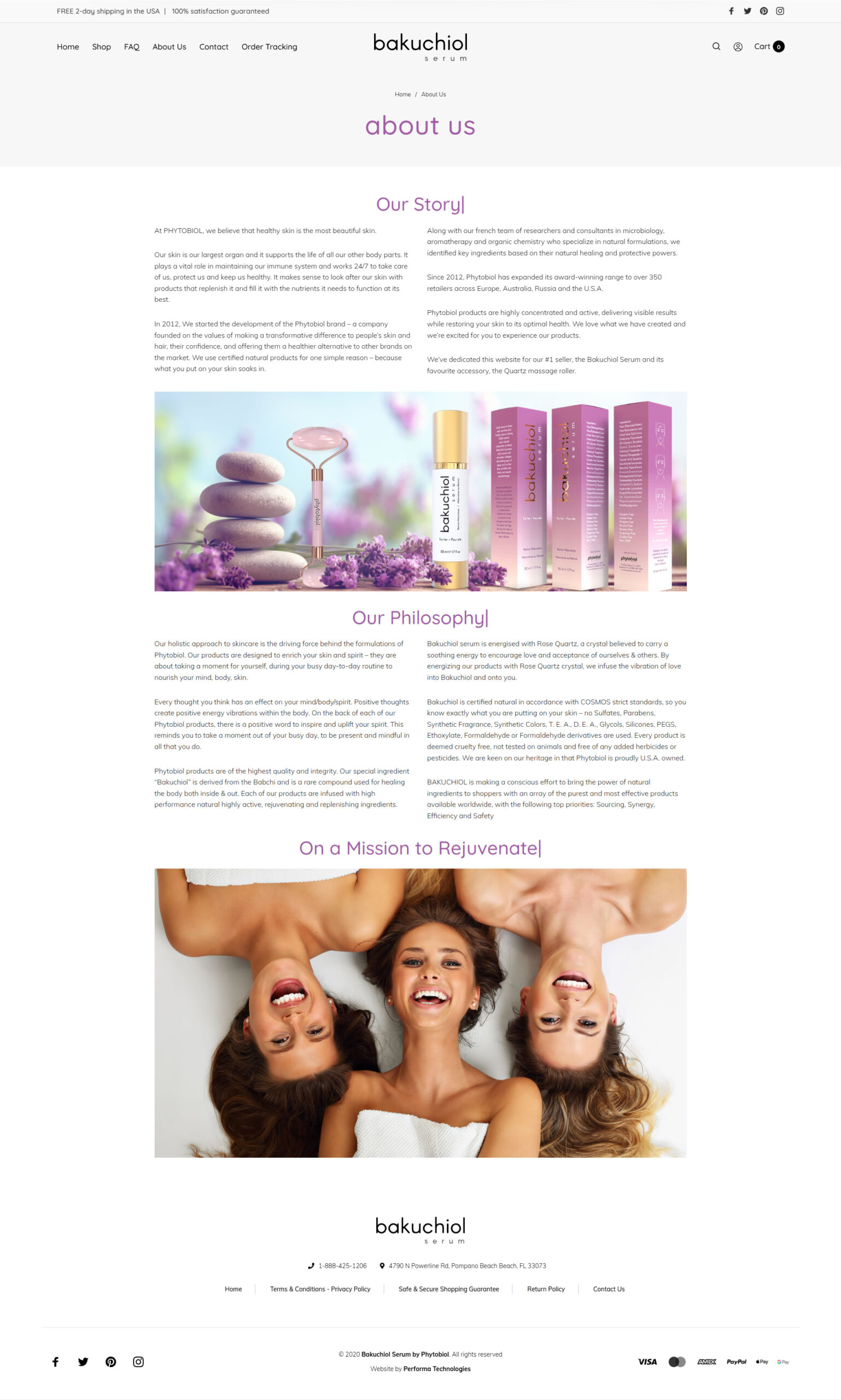
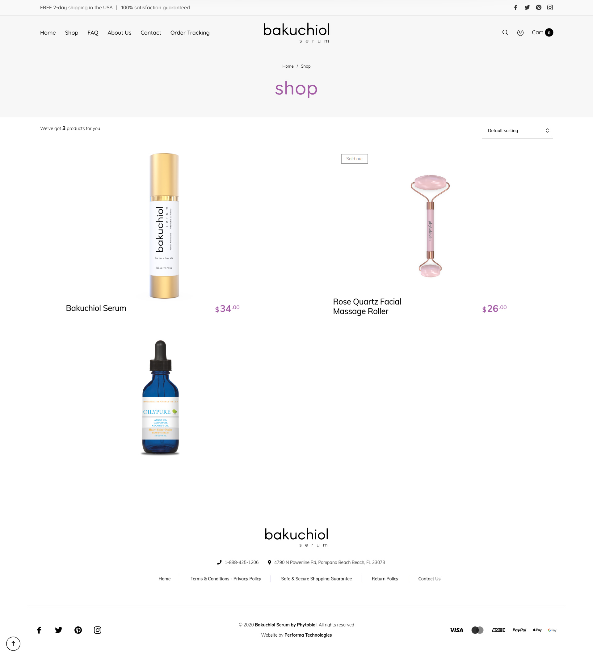
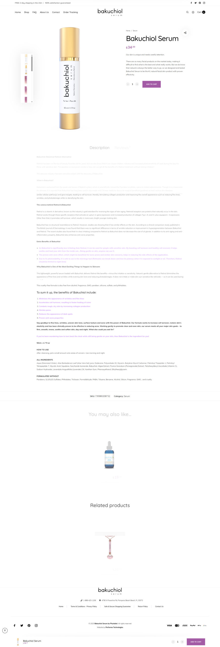
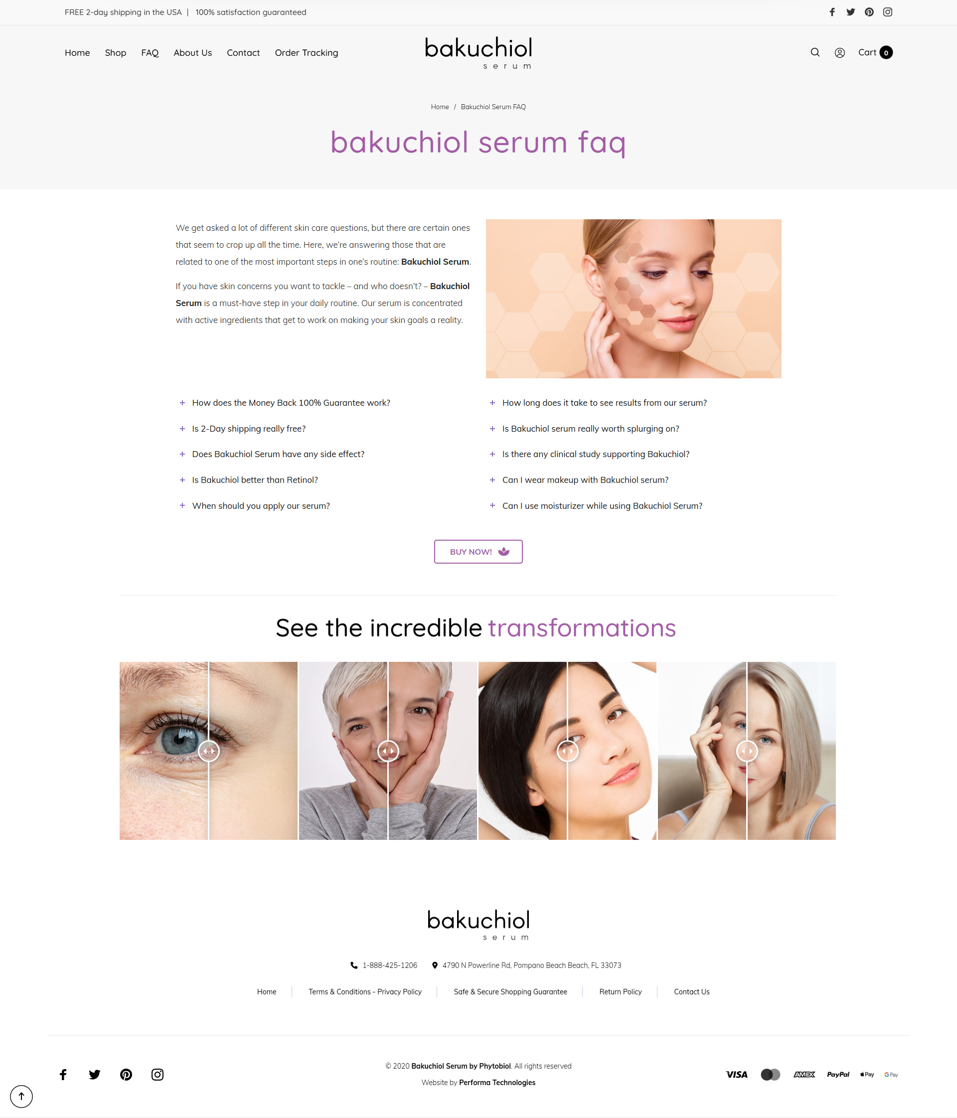
My role involved designing the logo, developing the full packaging system, and creating a clean, elegant website that introduces the product and highlights its benefits.
Client
Bakuchiol Serum by Phytobiol
Services
Web Design, Logo Design & Packaging
Key Challenges
Branding Development
Logo Design
The Bakuchiol Serum logo is a clean, modern wordmark designed to convey purity, simplicity, and effectiveness. The brand name “bakuchiol” is set in a bold, minimalist typeface, giving the product a strong, confident presence. Beneath it, the word “serum” appears in a lighter, refined style, adding balance and elegance while clearly identifying the product category.
The simplicity of the typography allows the logo to blend seamlessly into the beauty and skincare space, while still standing out through clarity and sophistication. This straightforward, modern approach ensures versatility across the bottle, packaging, website, and marketing materials.
Design System
Color Palette
Inspired by beauty and wellness branding, the palette includes:
- Gradient Rose–Lavender: softness, calm, femininity
- Gold Metallic: luxury, effectiveness, premium feel
- Soft Cream: balance and neutrality
Gradient Rose-Lavender
#B77399 to #FCECE1
Deep Lavender
#A35BA5
Soft Cream
#E6CCC1
Gold Metallic
#EDD077
Typography
Quicksand
A B C D E F G H I J K L M N O P Q R S T U V W X Y Z
a b c d e f g h i j k l m n o p q r s t u v w x y z
Packaging Design
The packaging design blends luxury with softness.
- A rosy-to-lavender gradient evokes femininity, calmness, and skincare indulgence.
- Gold foil elements elevate the product and add a premium feel, making it suitable for boutique shelves or direct-to-consumer branding.
- The typography is clean and refined, ensuring readability while aligning with modern beauty aesthetics.
- The bottle design pairs white minimalism with gold accents, reinforcing a sense of purity and sophistication.
The combination creates a package that feels high-end, elegant, and scientifically credible.
Website Design
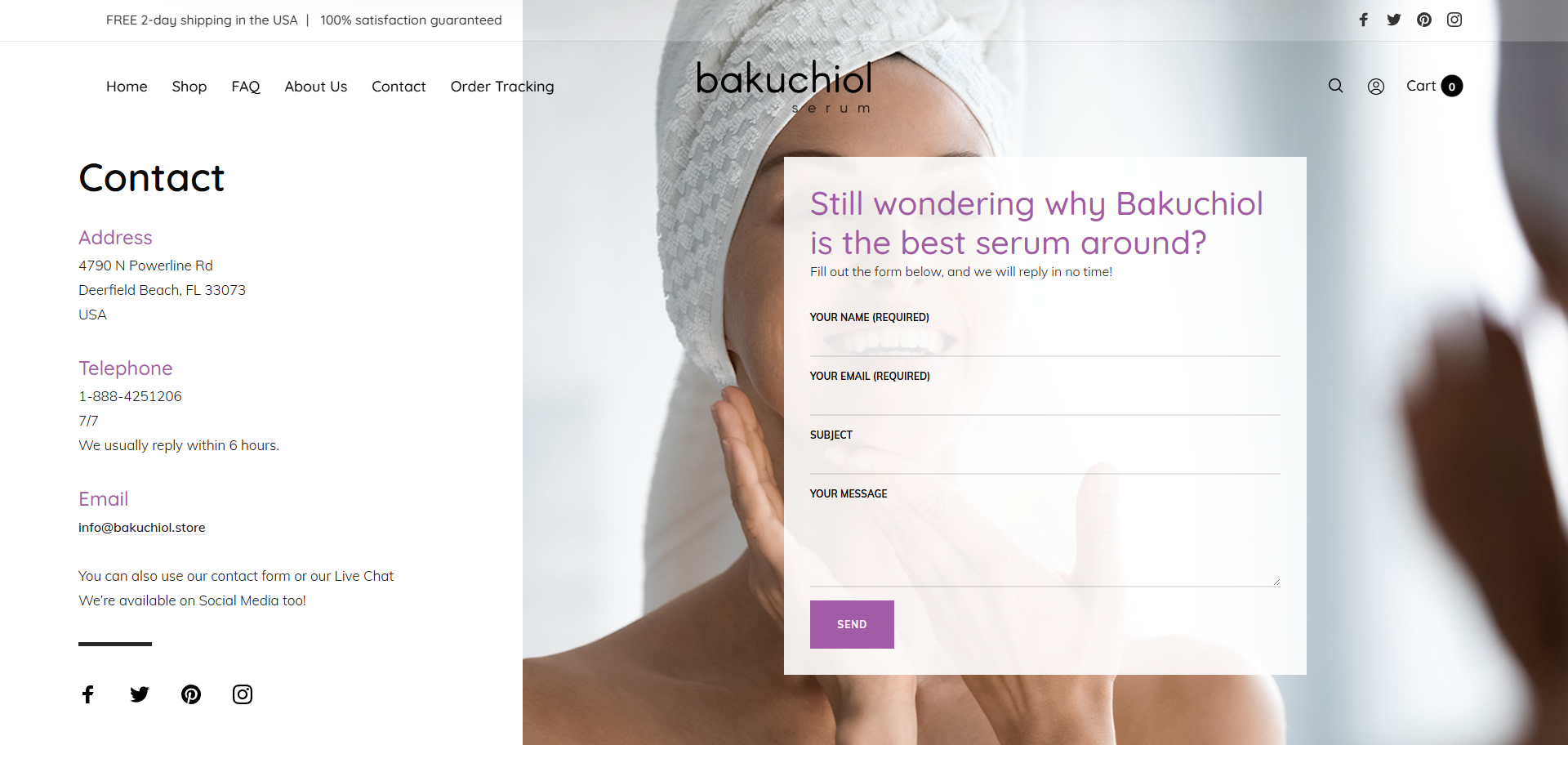
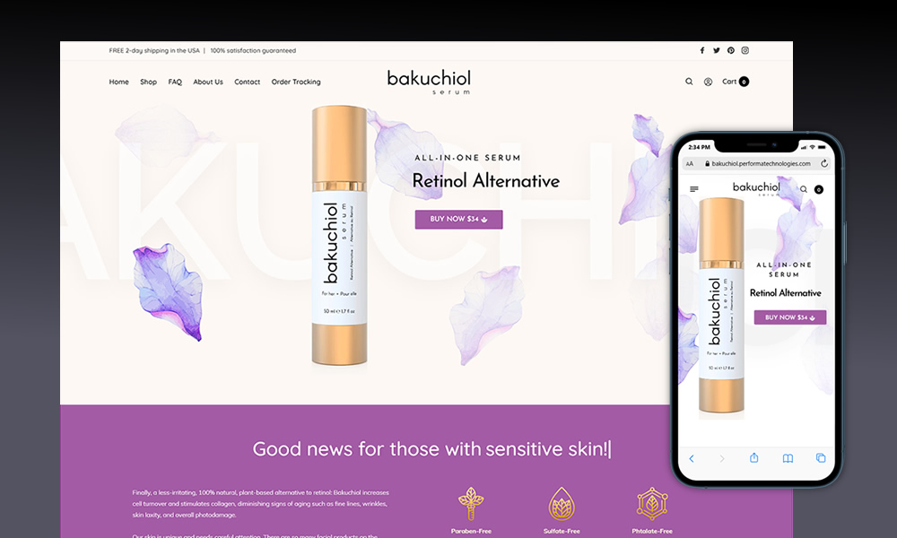
The website was designed to feel clean, modern, and product-focused.
Key features include:
- A minimal homepage introducing the product with strong hero imagery
- Sections explaining the benefits of Bakuchiol and how it compares to retinol
- A clean ingredient list and usage instructions
- Soft gradients and white space for a luxurious, breathable layout
- Clear CTAs designed to drive sales and build brand trust
The overall design mirrors the packaging aesthetic, ensuring a seamless experience from first impression to checkout.
What I Deliver
The Bakuchiol Serum brand now has a complete, cohesive identity—from logo to packaging to digital presence. The final result is a visually elegant, modern, and credible skincare brand that feels premium and approachable, ready for both online sales and retail environments.

