Intro
Cooking can be challenging for people who are blind, have low vision, or are experiencing age-related vision loss. Yet with the right tools, support, and thoughtful technology, it can become a safe, empowering, and enjoyable activity. Today, more accessible services and innovations are helping break down these barriers—making it possible for everyone to navigate the kitchen with confidence.
This project focuses on creating an app and responsive website that recommend adaptive cooking tools, techniques, and resources. The goal is to make cooking more accessible and to help users discover greater independence, creativity, and joy in the kitchen.
The Goal
To help users easily find, understand, and prepare recipes through audio or enhanced visual support, while also identifying the ingredients and adaptive tools needed for safe cooking.
Services
UX Research, Visual Design, App Design, Responsive Website Design
Key Challenges
Research
For the Cookbook tool for people who are blind, I conducted two usability studies:
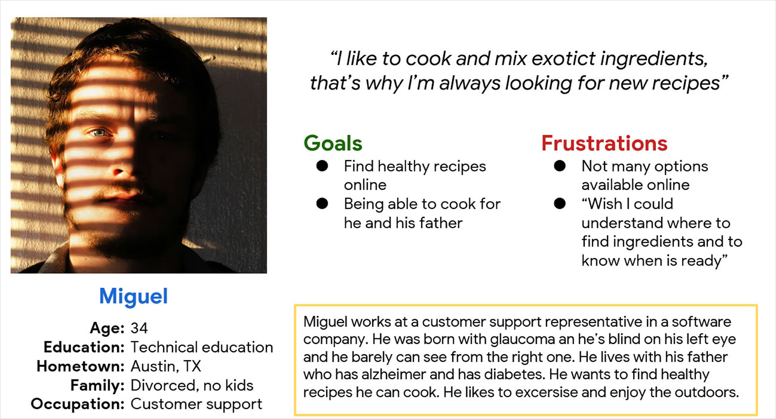
Target Audience
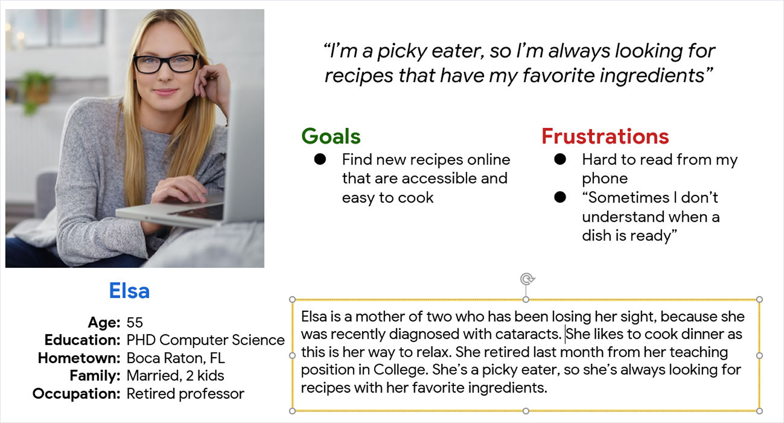
People who are blind or visually impaired that needs to be independent. 21+ years old.
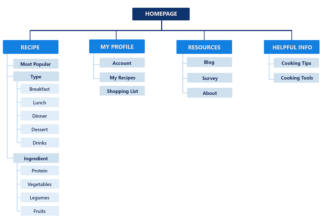
Design Architecture
Mockups
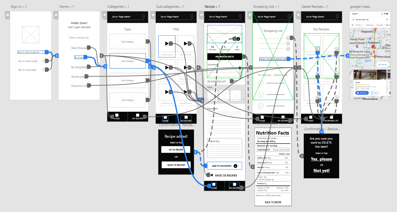
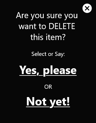
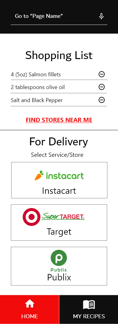
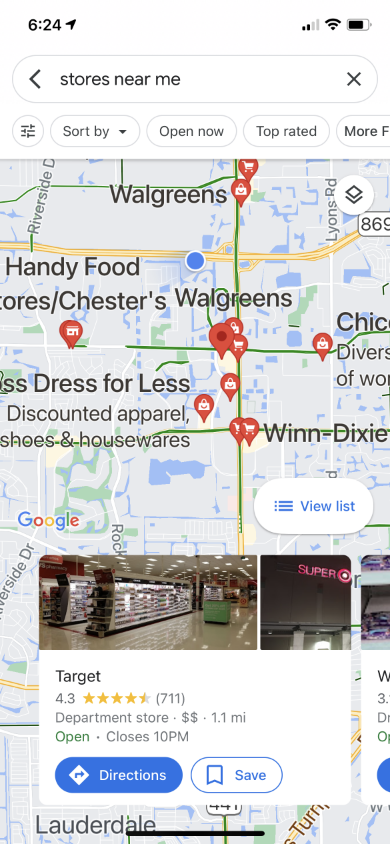
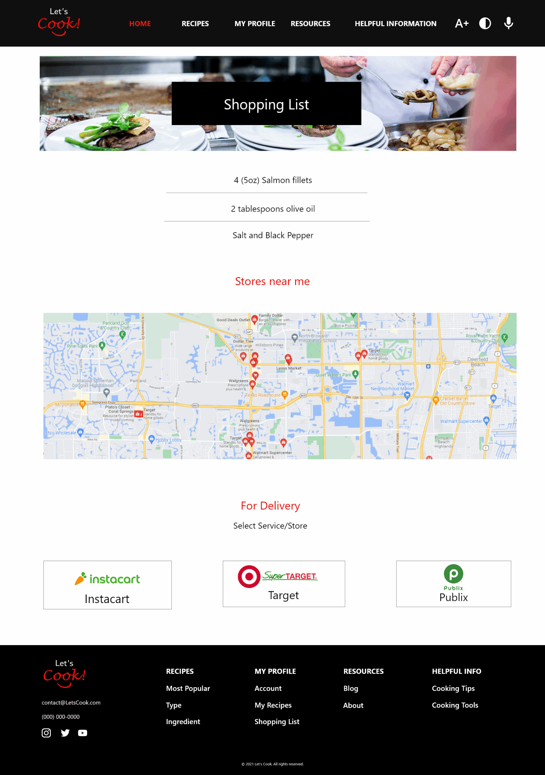
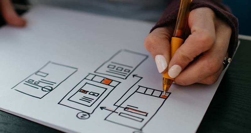
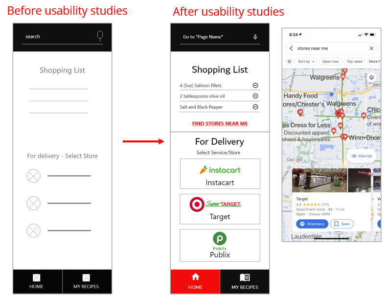
First drafts of the designs show don’t include “Find Stores Near Me” . I decided include a link to Google Maps based on the user’s location. Also, icons were added to the add the function to delete an ingredient.
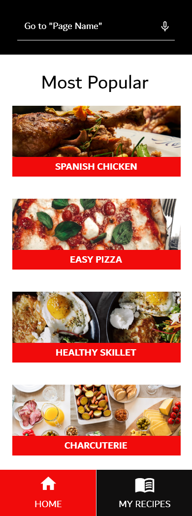
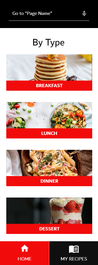
The first usability study shows that users wanted a more direct way to navigate thru the voice command option. It went from “Search” to “Go to ‘Page Name’”
Mockups
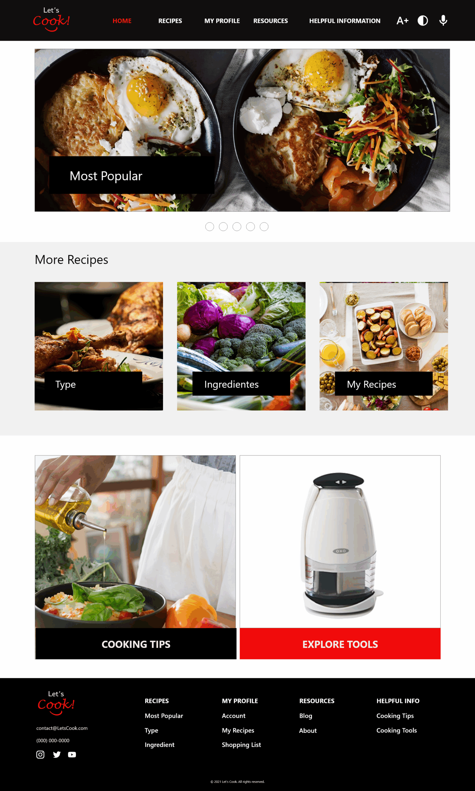
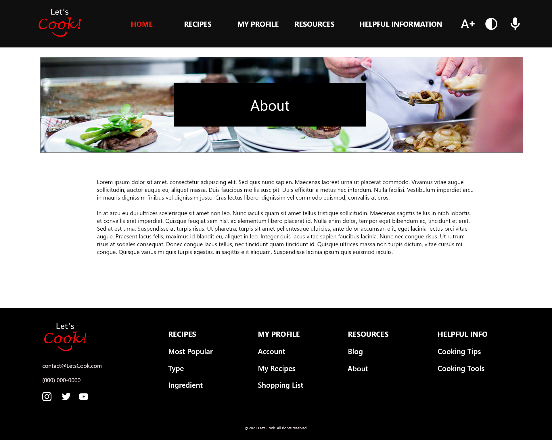
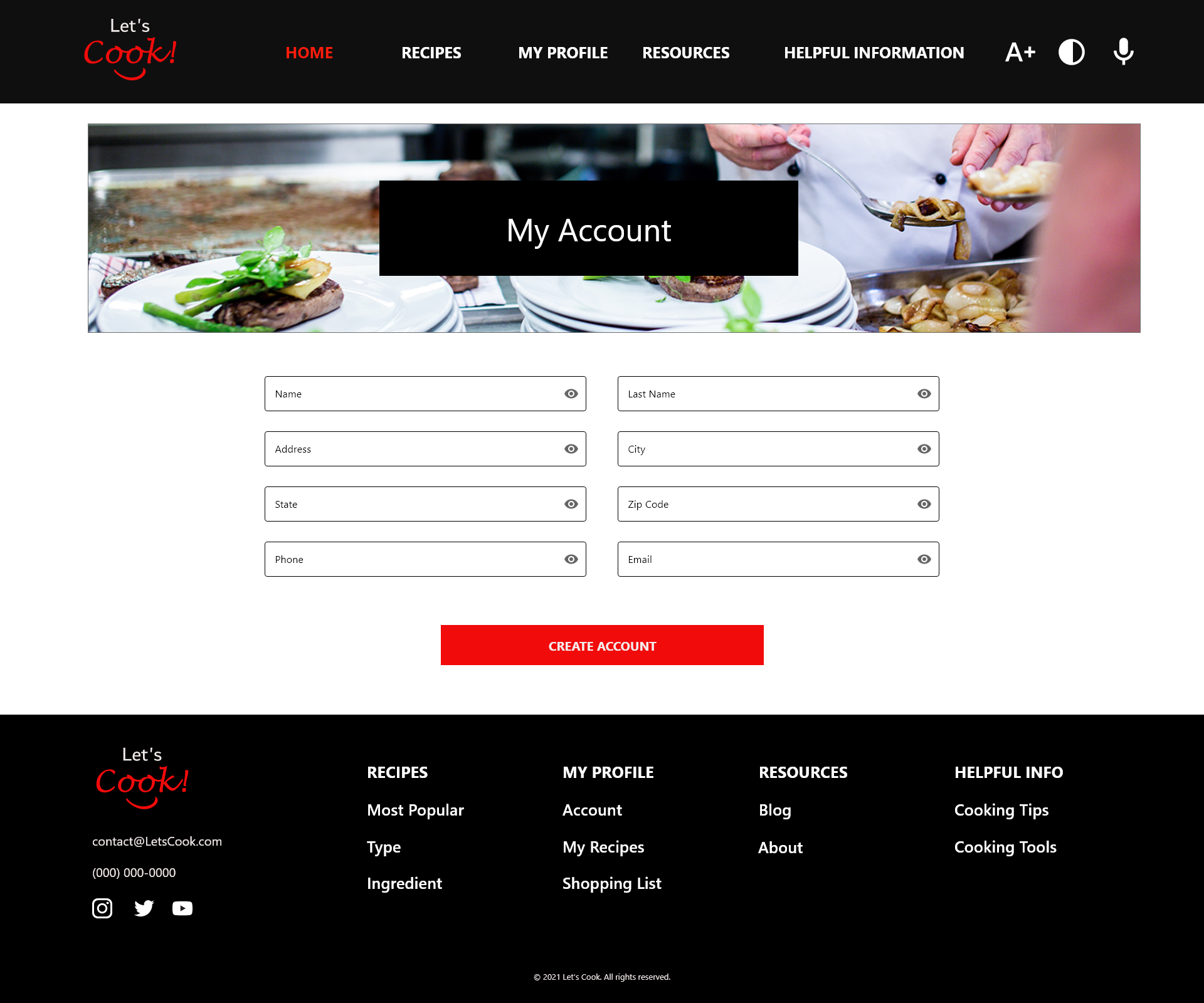
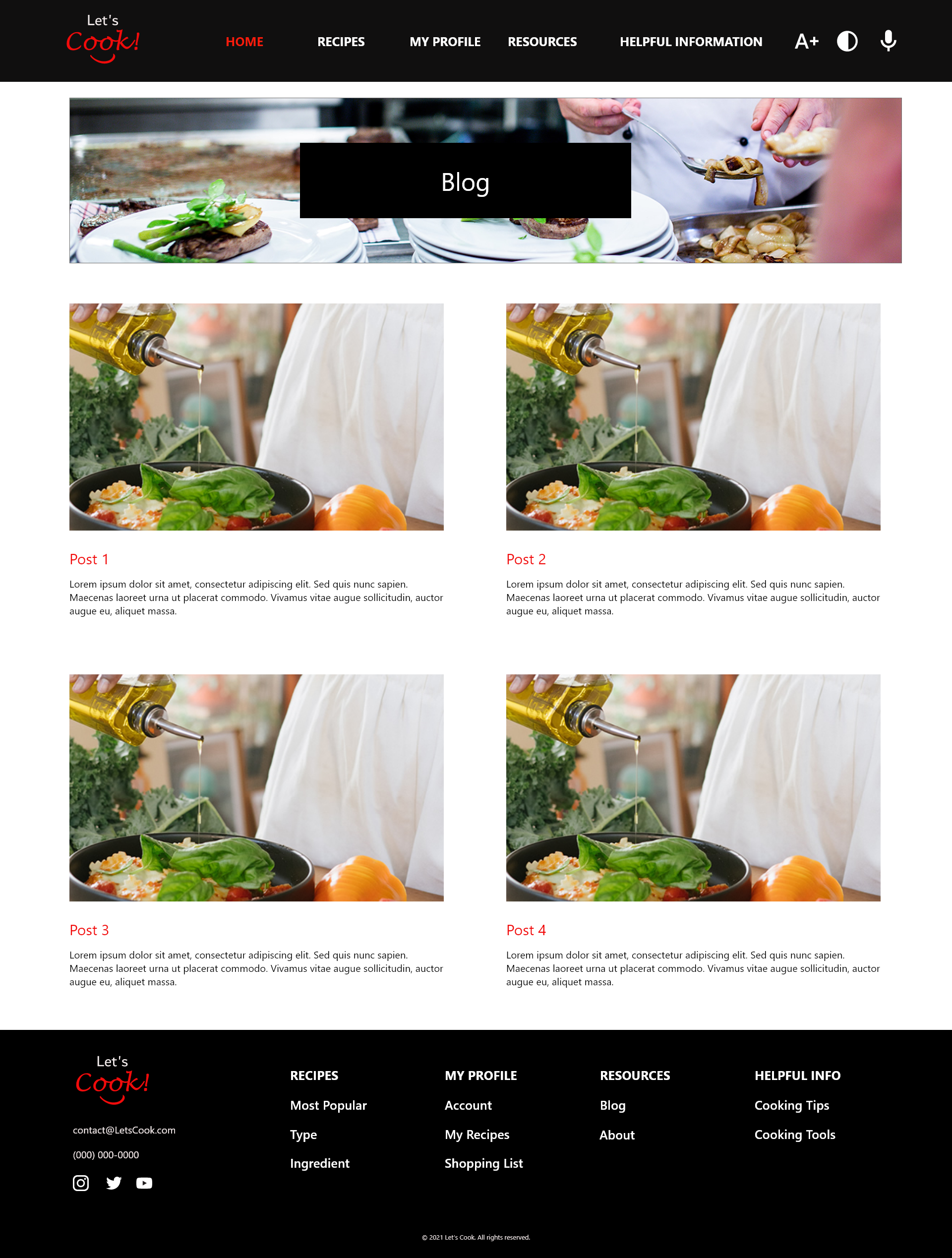
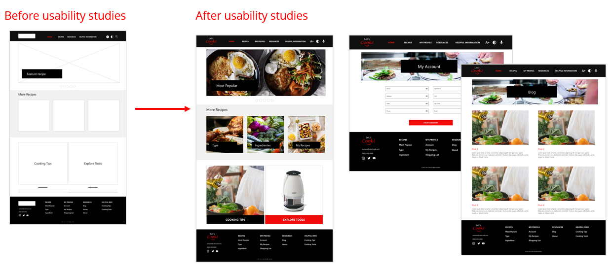
After a secondary usability study for the responsive website, we added more links such as “Blog” About Us” “My Account” and easy to functions such as “Increase Text” and “Contrast”.
What I Delivered
App
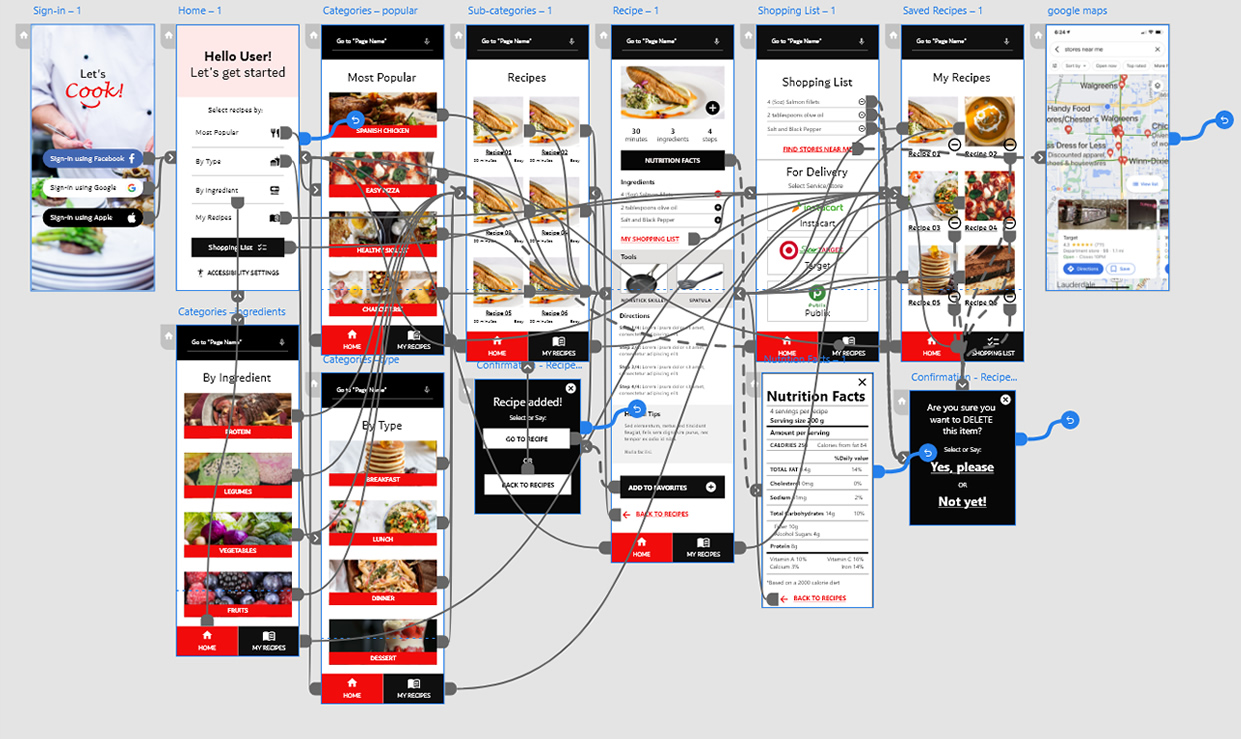
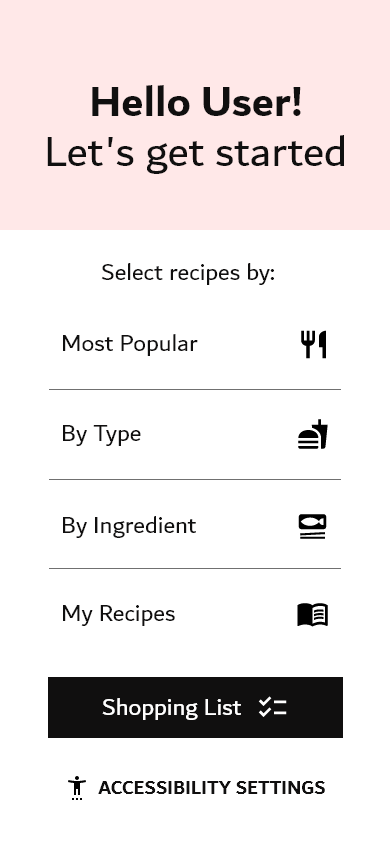
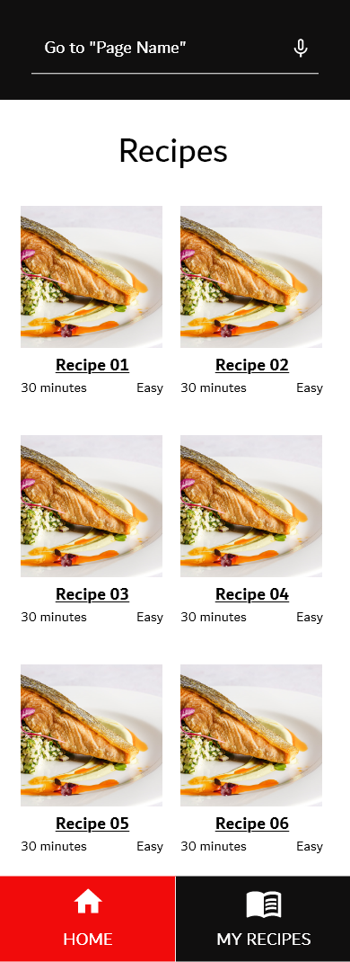
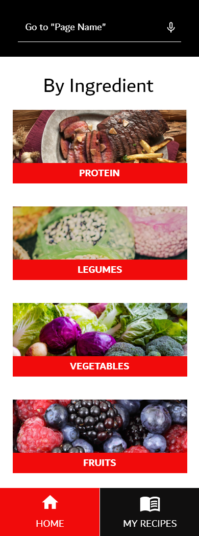
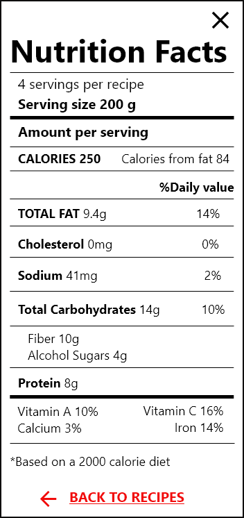
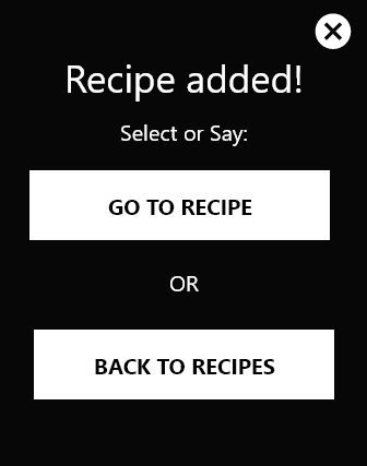
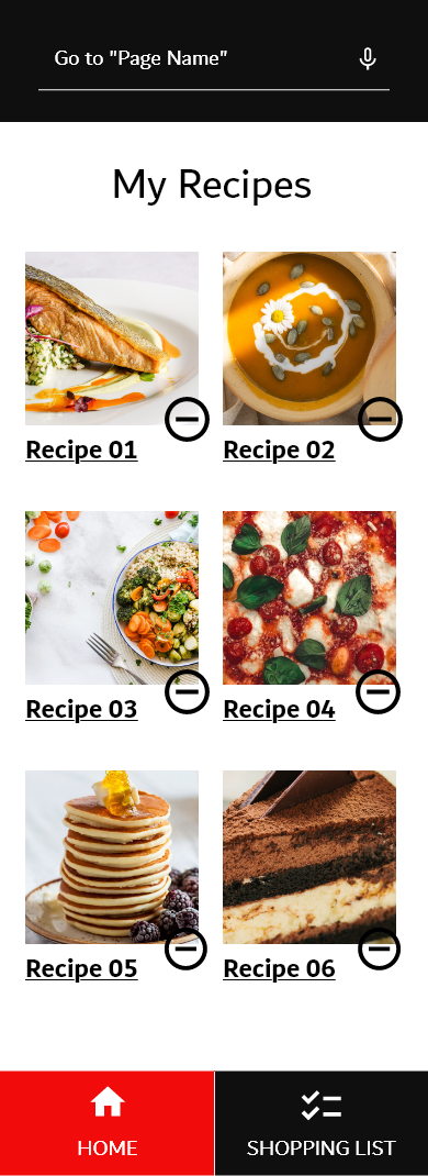
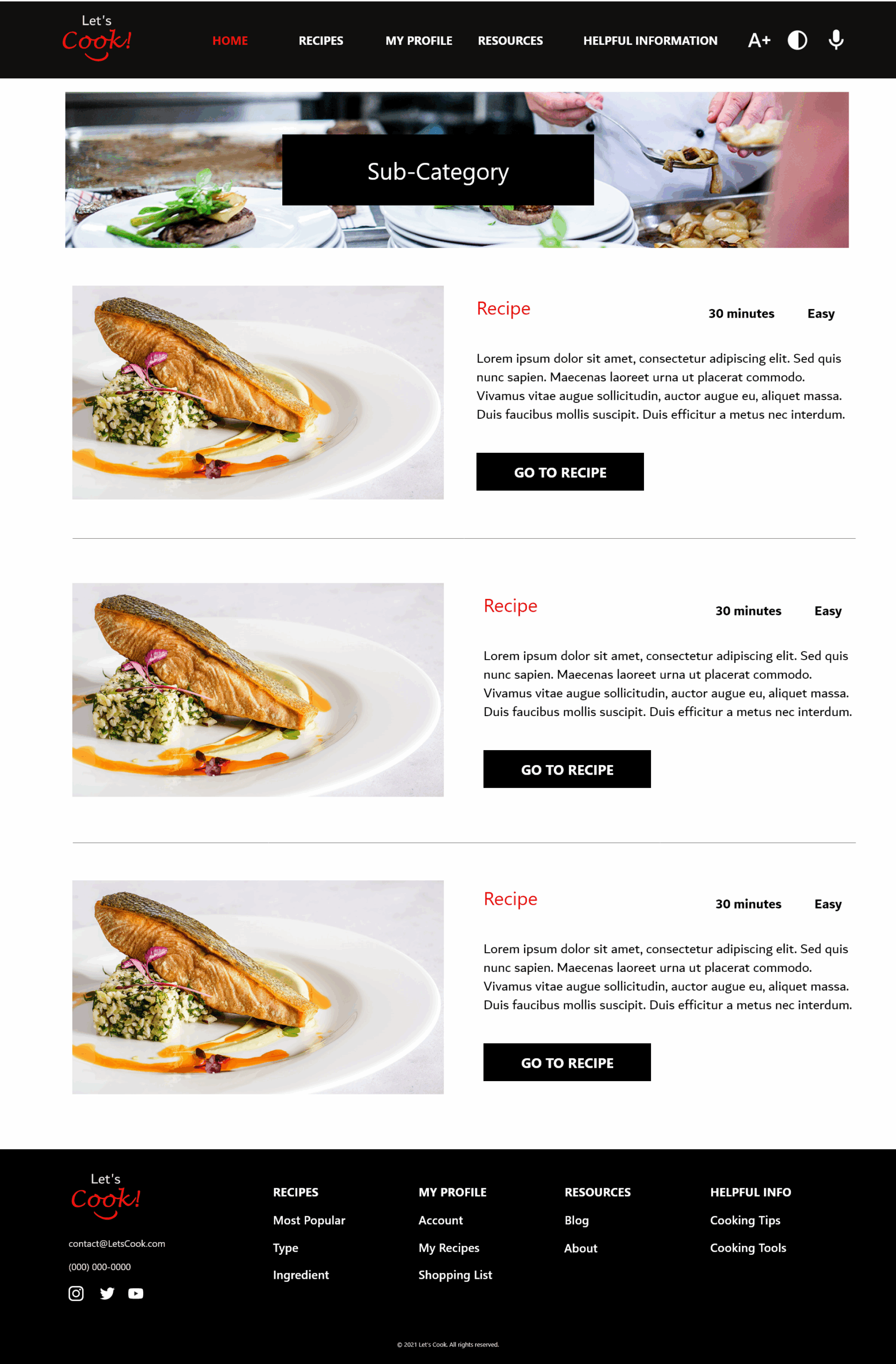
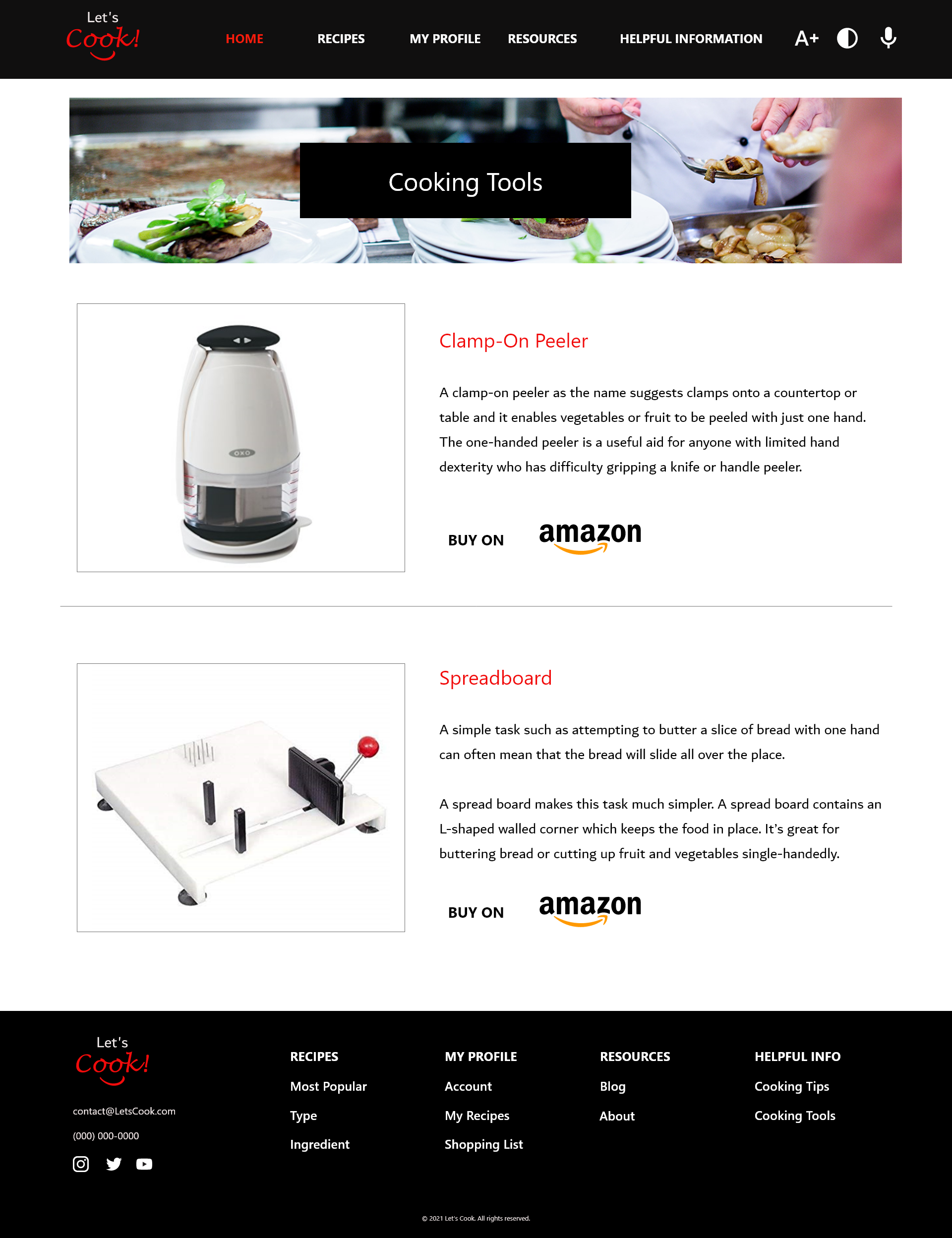
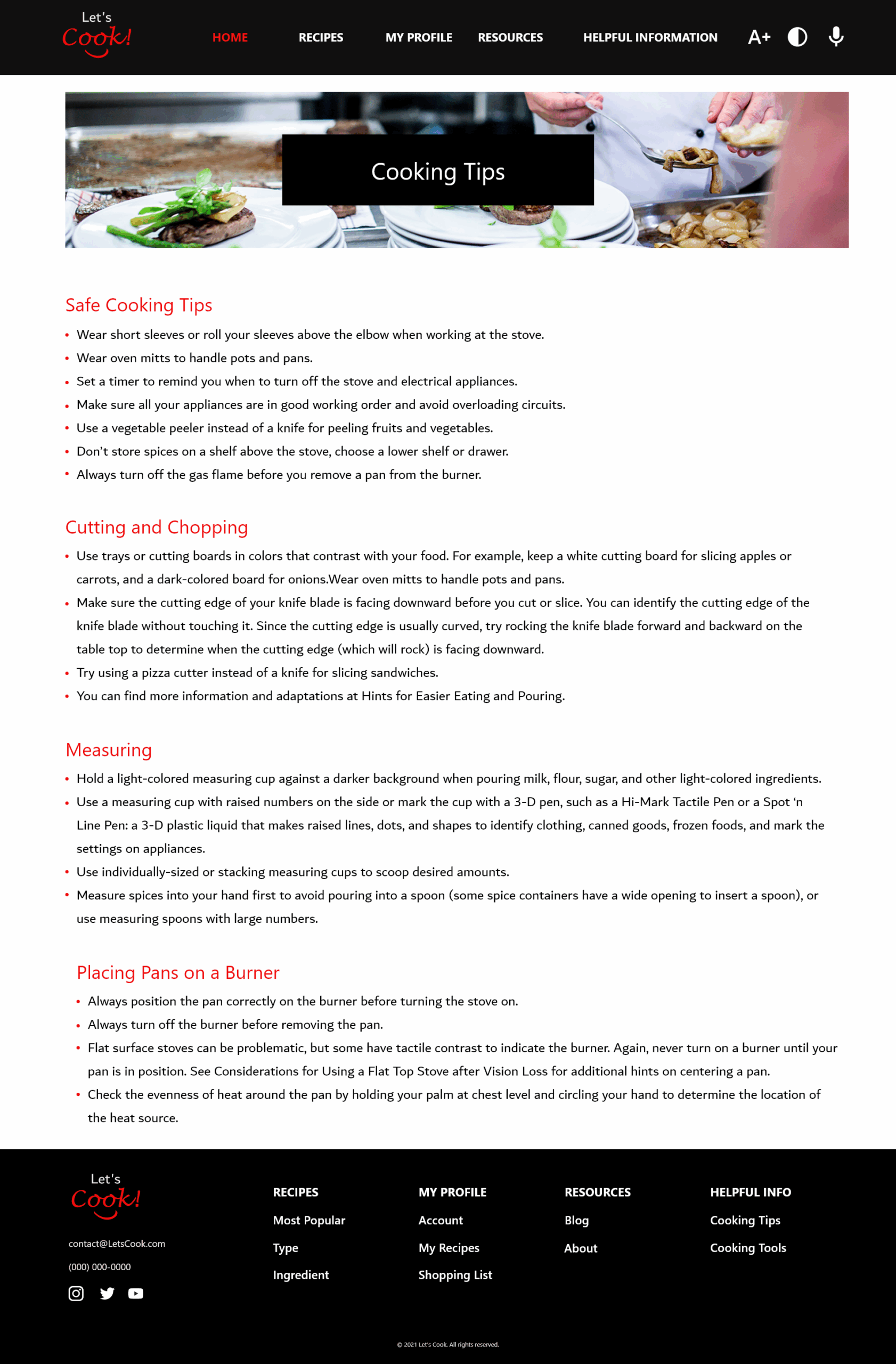
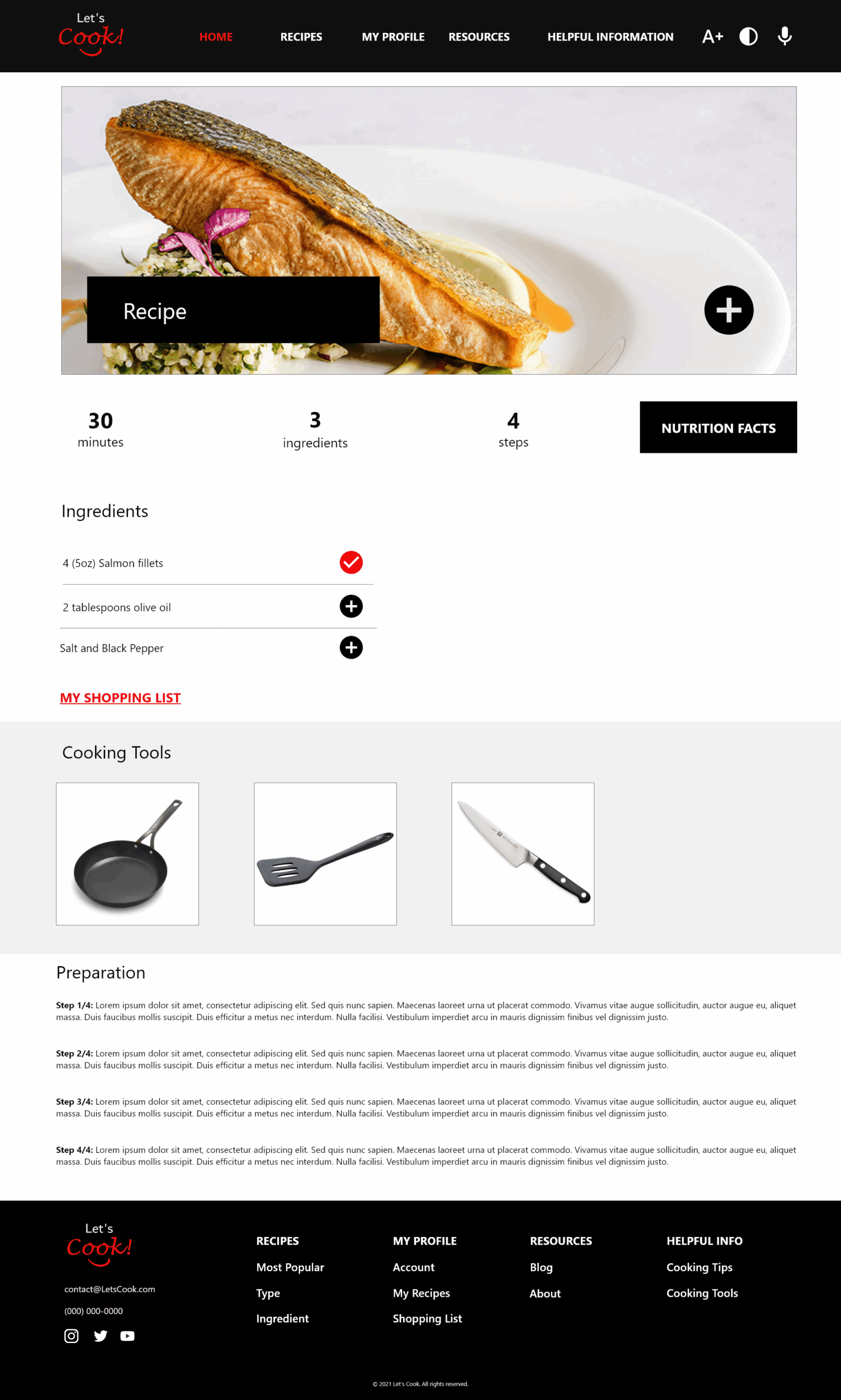
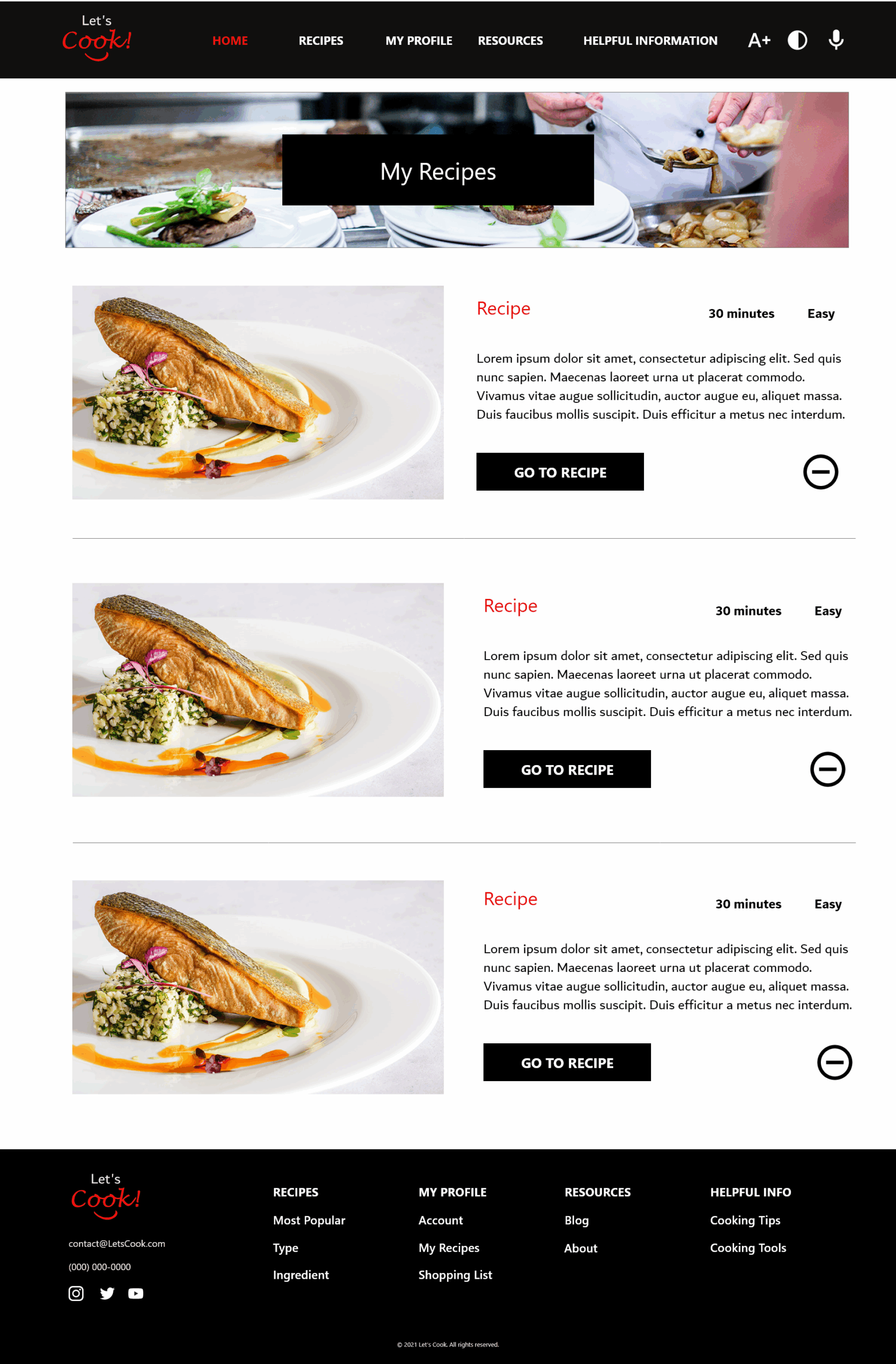
The final hi-fidelity prototype shows user flows for Recipes (Featured, Type, Ingredients), Shopping List, My Recipes, Cooking Tips, and Cooking Tools.
Prototype made in Adobe XD
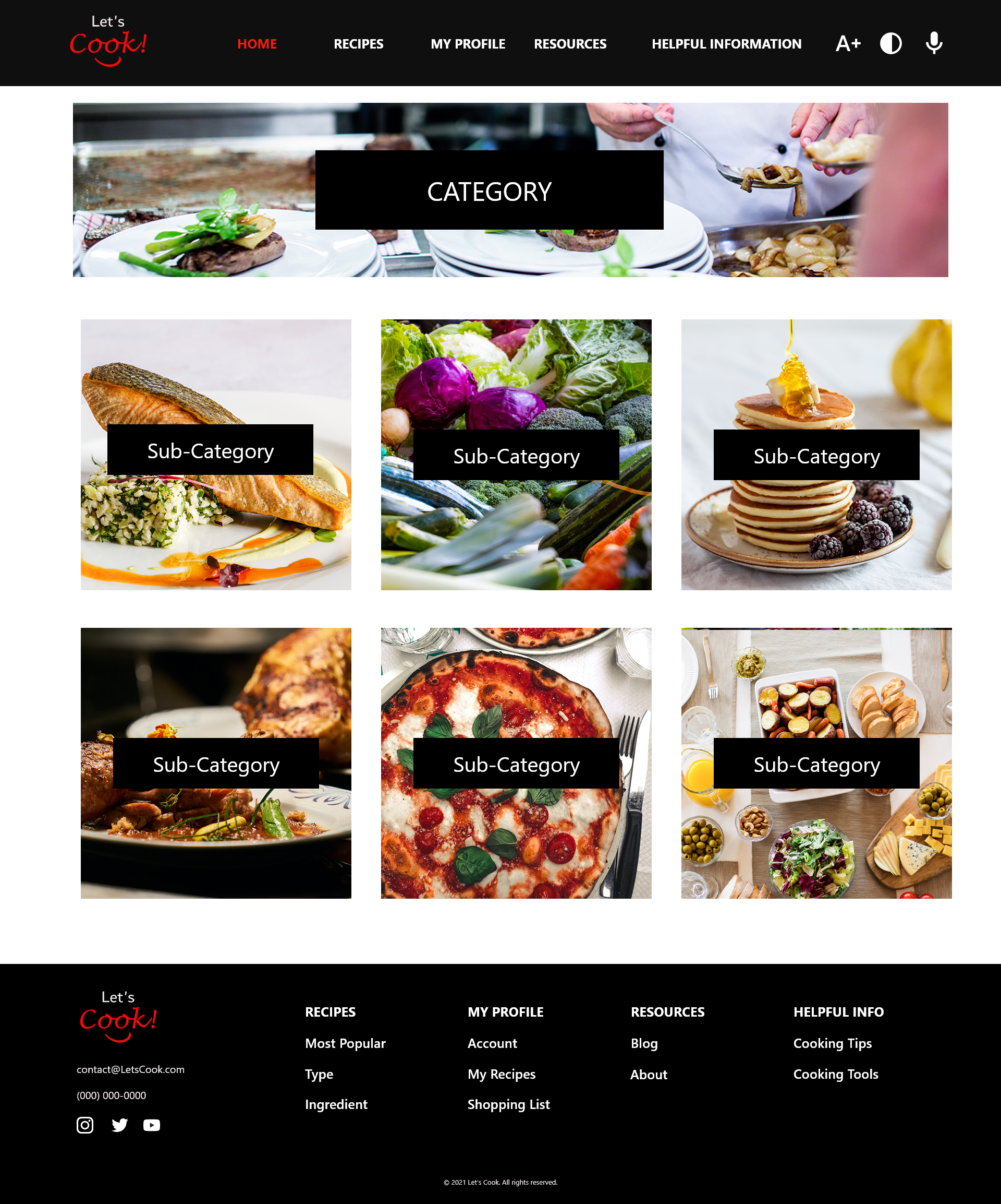
Responsive Website
The final hi-fidelity prototype shows user flows for Recipes (Featured, Type, Ingredients), Shopping List, My Recipes, Cooking Tips, and Cooking Tools.
Prototype made in Adobe XD
