Intro
A tour to an art gallery is a great way to acquired valuable art pieces, know about new artist, support local artists and/or expand your knowledge while socializing.
There are aspects that prevent people from attending exhibitions such as time constrain and, for tourist, added expenses. A check-in app is a great way to save time, improve visitor experience and also to promote events, sell tickets and the visit ahead.
The Goal
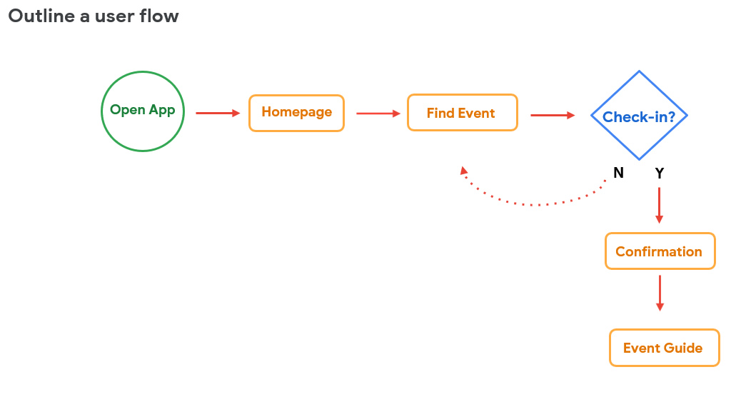
To check-in to an event from the app to avoid lines and save time and also and to be able to plan the visit.
Services
UX Research, Visual Design, UI Design
Key Challenges
Research
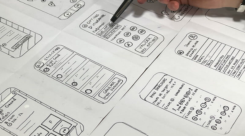
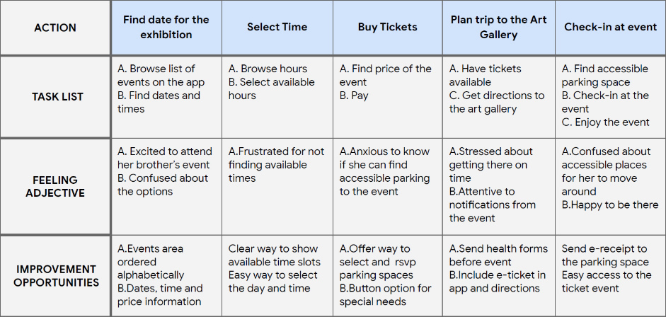
For the Tour check-in app for an art gallery in New York City, I conducted two usability studies:
Target Audience
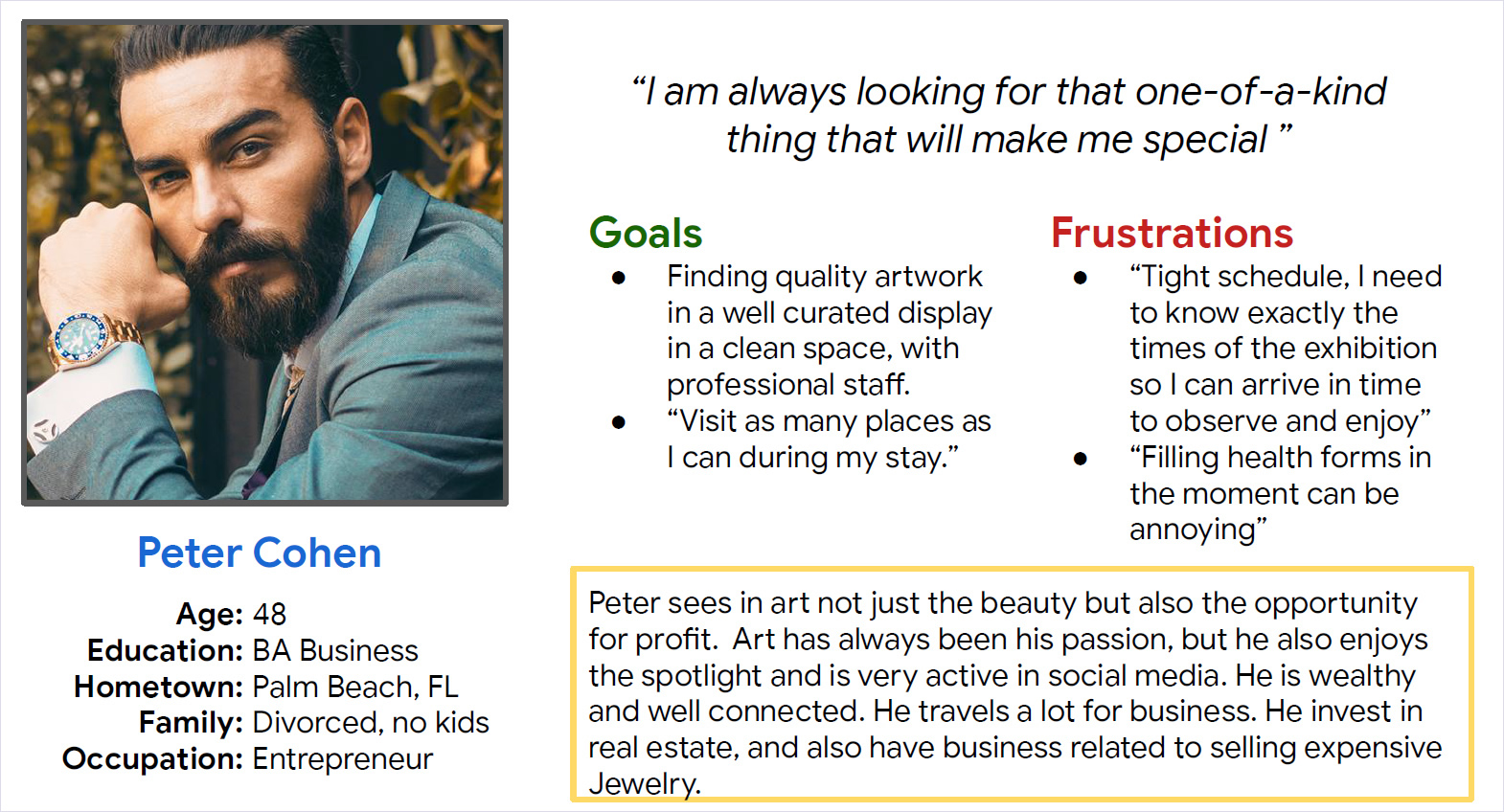
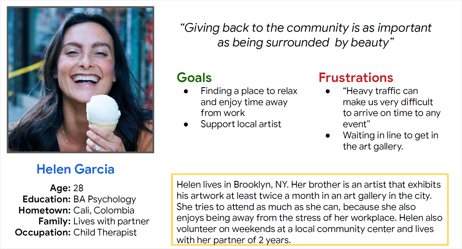
Tourists, art collectors and local art lovers, 21+ years old.
Design Architecture
Round 1 Findings
Mockups
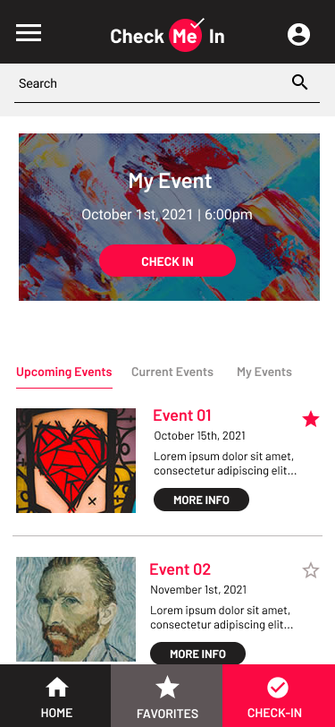
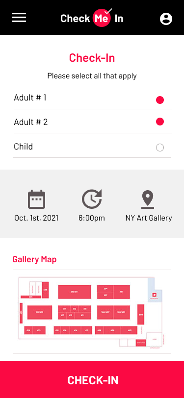
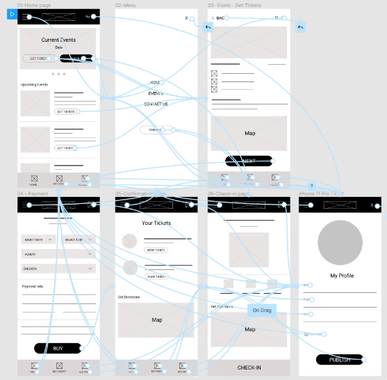
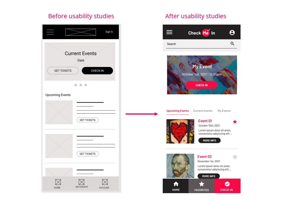
First drafts of the designs show “Get Tickets” and “Check-in” buttons equally important. I decided to focus on the Check-In as the main action. Then a tab navigation area was added for finding/buying tickets as secondary action.
The first usability study shows that users wanted to find events/artist faster, so a Search area was added on top.
Mockups
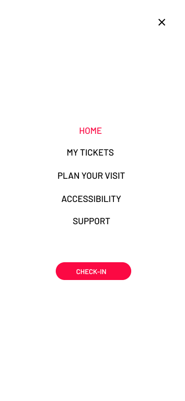
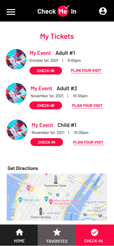
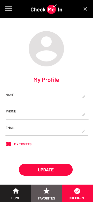
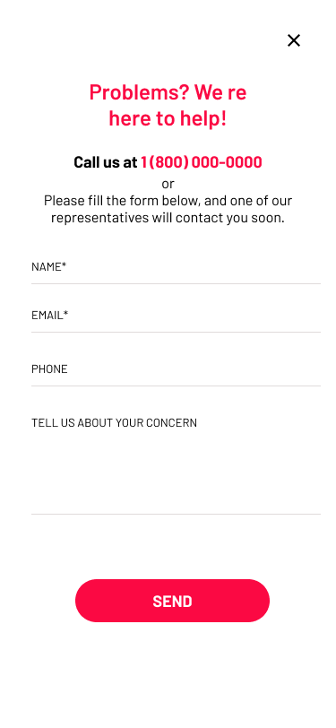
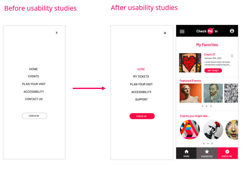
After a secondary usability study, the main navigation was reworked to make it easier and faster for the users to complete the check-in. Events was replaced for My Tickets, Contact Us for Support and the button for Check-in was made the focused action.
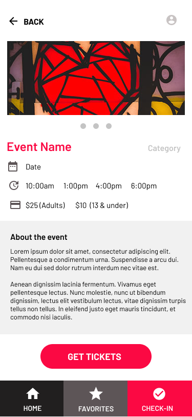
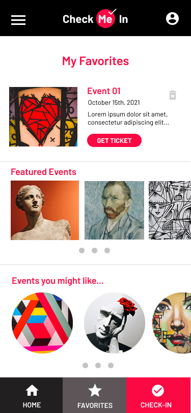
A “Favorite” action and page was added for users to save events that they would like to attend in the future.
What I Delivered
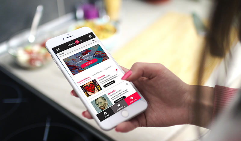
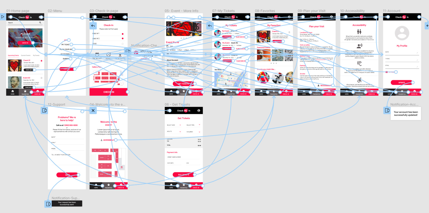
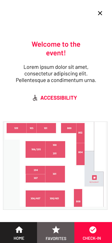
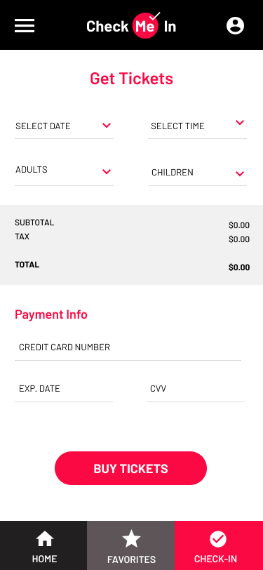
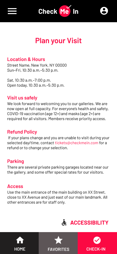
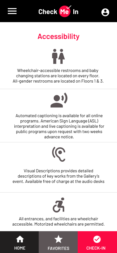
The final hi-fidelity prototype shows user flows for checking-in at the event, to get information, buy tickets to future events, select favorite events and, also for users to plan the visit, and important accessibility information.
Prototype made in Figma.
