Intro
Waterfront Properties is a premier real estate agency specializing in luxury homes across South Florida’s coastal communities. Their website plays a central role in showcasing exclusive listings and attracting high-value buyers, but the digital experience needed a fresh, modern approach to match the sophistication of their brand.
This project highlights the visual and strategic decisions made to enhance their online presence — from refining the brand elements to creating a more intuitive, elegant, and conversion-focused website experience.
Client
Waterfront Properties
Services
Web Design & Logo Design
Key Challenges
Branding Development
Logo Design
The Waterfront Properties logo features a refined, coastal-inspired design that communicates luxury, stability, and a connection to the water. The icon is built from a stylized architectural structure—suggestive of a modern shoreline home. This element create a balanced visual harmony between real estate and waterfront living.
A gradient of deep to light blue reinforces the maritime identity, transitioning from a rich #1B66AA to a lighter #74AEE2. The combination evokes clarity, trust, and a serene coastal atmosphere. The typography is bold, geometric, and confident, complementing the icon with a clean, upscale presence suitable for a premium real estate brand.
Color Palette
The brand palette is inspired by the natural tones of the ocean and shoreline. Deep Navy Blue is the primary color, symbolizing depth, reliability, and high-end service.
It is complemented by Aqua Blue accents that capture the freshness and movement of water, adding a vibrant and contemporary touch. Neutral tones such as white and soft gray provide balance, ensuring the overall look stays clean, luxurious, and easy to navigate.
Deep Blue
#1B66AA
Aqua Blue
#FCCFB9
Soft Gray
#8A4E30
Website Design
Overview
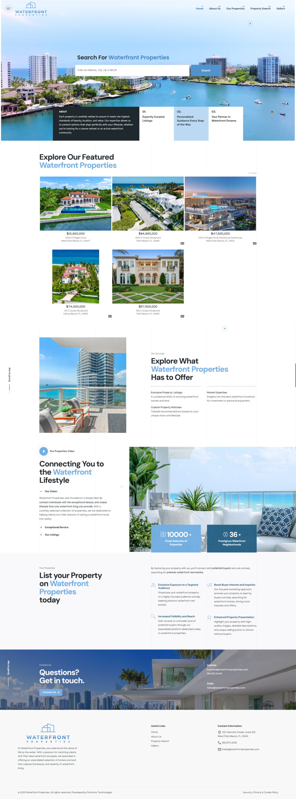
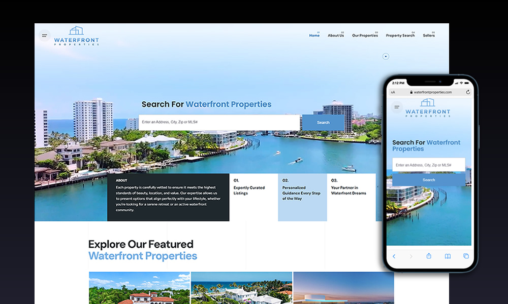
The Waterfront Properties website projects a refined, premium digital presence that aligns with the company’s high-end real estate offerings. The design uses large, high-resolution photography of waterfront homes to evoke the aspirational lifestyle behind the brand. Subtle coastal tones and elegant typography reinforce the sense of luxury while maintaining clarity and usability.
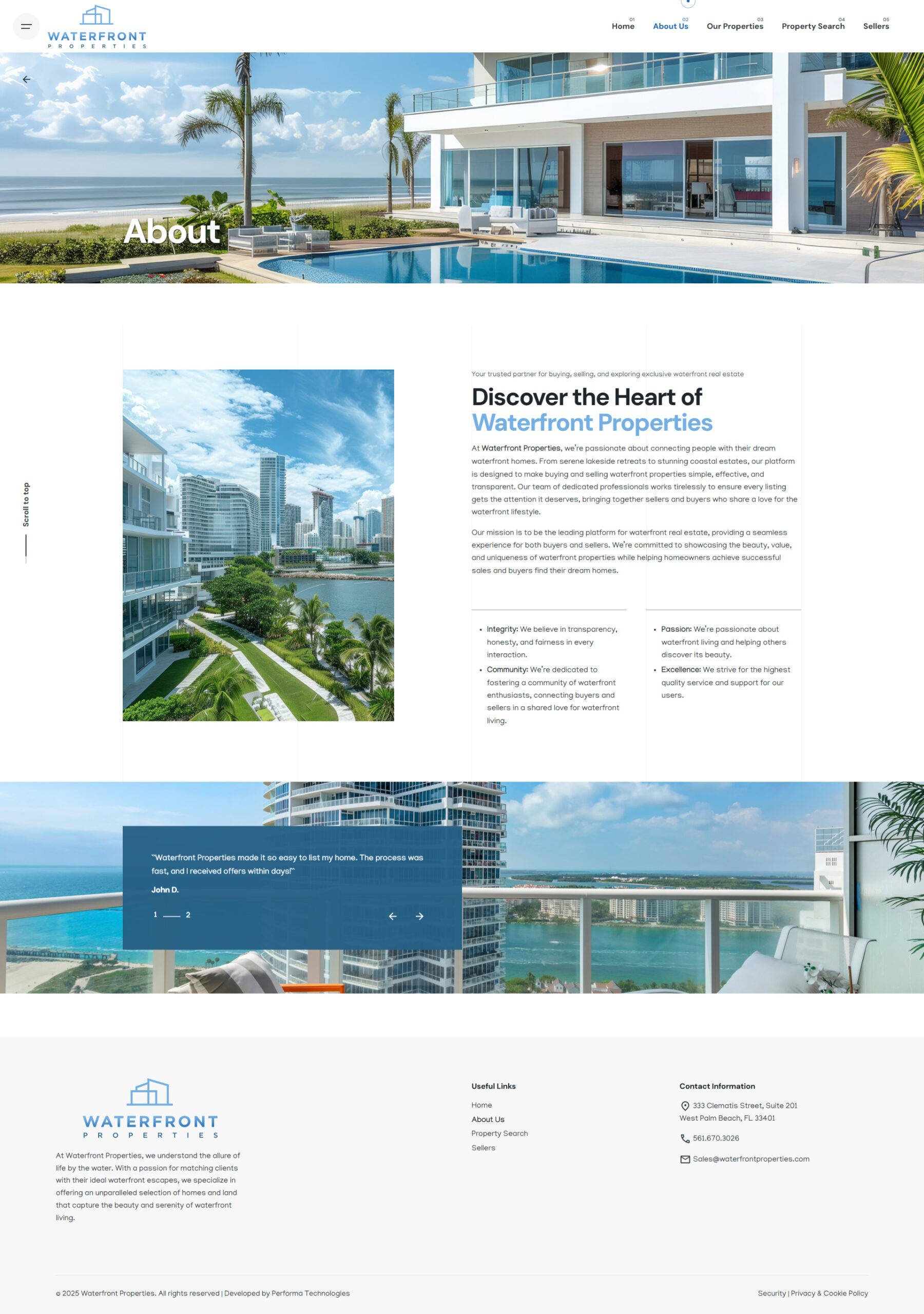
The visual direction draws directly from the brand’s identity—featuring crisp whites, deep ocean blues, and refined accents—to ensure the site feels fresh, trustworthy, and premium. The goal is to provide users with a smooth experience from the first impression through property discovery and inquiry.
Navigation & Structure
- Hero & Featured Listings: The homepage prominently features a rotating hero with luxury waterfront properties, inviting users immediately into the world of upscale real estate.
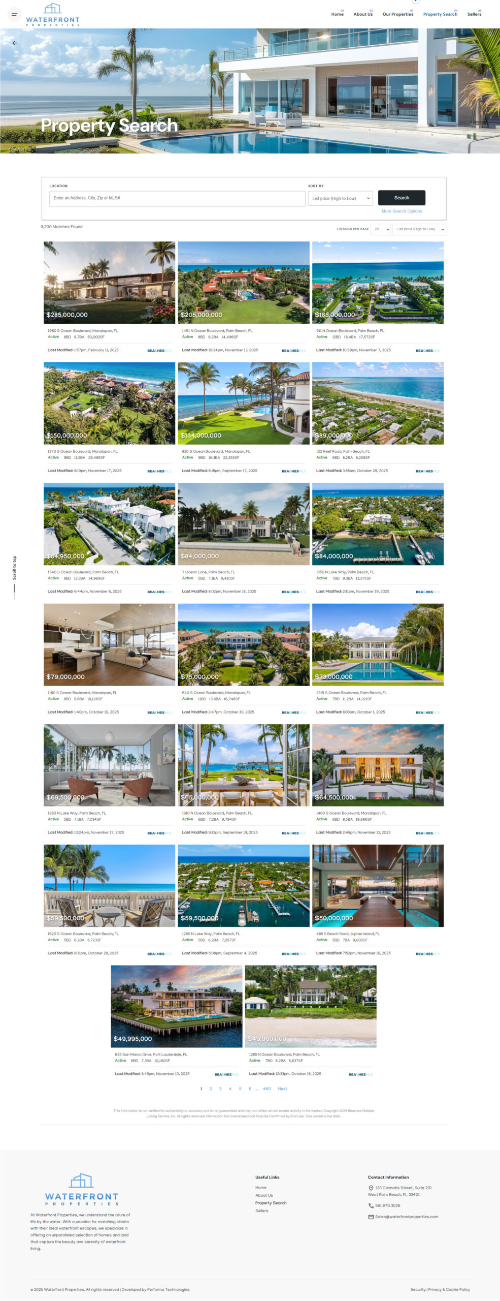
- Property Search: A powerful, detailed search functionality allows visitors to filter by price, waterfront type (ocean, river, canal), property size, and more, making it easy for high-net-worth buyers to find what they’re looking for.
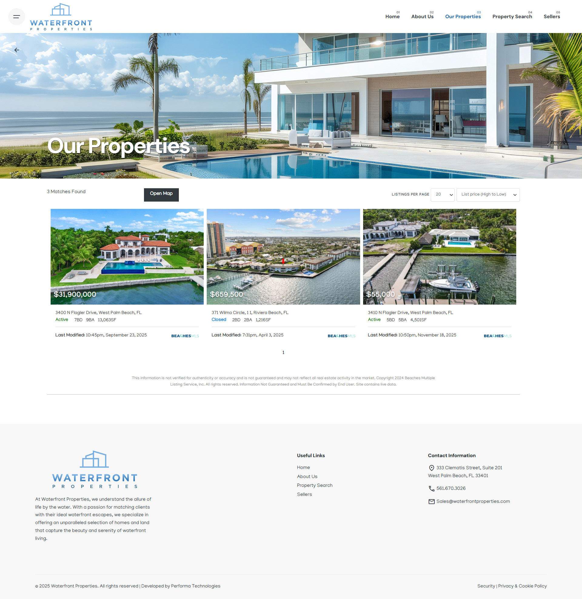
- Our Properties / Featured Listings: The site highlights a curated list of exclusive, high-value listings, showcasing Waterfront Properties’ deep market knowledge.
- About / Company Values: A section communicates the story of Waterfront Properties — their decades of experience, local expertise, and commitment to waterfront living.
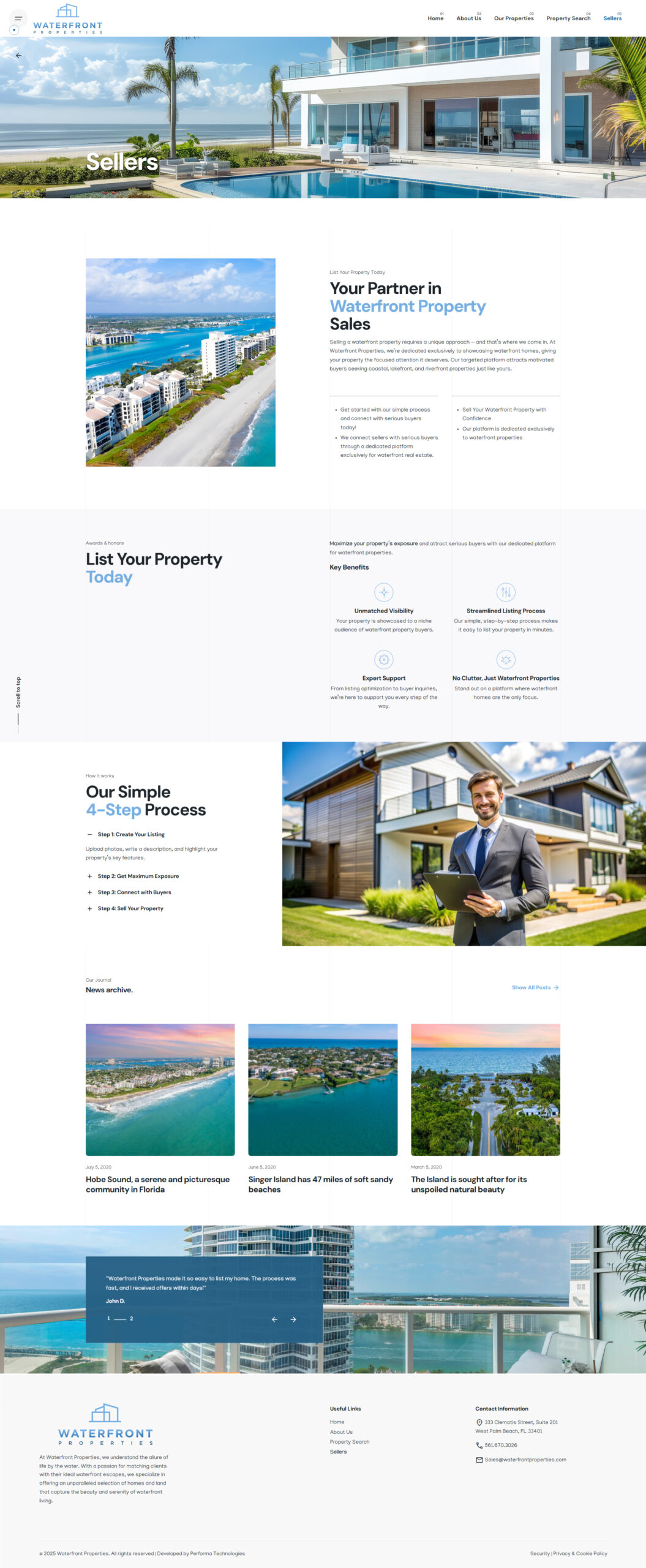
- Sellers Page: The “Sellers” section is tailored specifically for property owners, explaining their listing process, value proposition, and why Waterfront Properties is the right broker for waterfront homes.
Visual Design & Aesthetic
- The color palette leans into natural coastal hues: deep ocean blues, soft seafoam tones, sand-inspired neutrals, and crisp white backgrounds. This choice gives the site a calm but sophisticated feel.
- Typography is clean and elegant, balancing serif headers with readable sans-serif body text to communicate trust, luxury, and modernization.
- Imagery is a central feature: large hero shots, property detail photography, and lifestyle visuals emphasize the exclusivity of waterfront living.
- Whitespace & Layout: Generous margins and well-considered spacing provide a premium, uncluttered look that allows content and images to breathe.
Conversion & Lead Generation
- Contact & Inquiry Forms: Strategically placed CTAs guide visitors to get in touch, request property matches, or list their home.
- Seller Tools: The “List Your Property” experience is straightforward and tailored, making the process feel high-touch and specialized.
Provident Realty of South Florida - Trust Elements: The presence of featured high-value listings, agent expertise, and a clearly articulated company story all contribute to building trust and encouraging conversions.
